(Clarification: I hate menus presented on Televisions, I also hate menus in most televisions, but that's a different topic)
Here's the menu from a local A&W, or at least the portion of the menu listing their burger options:
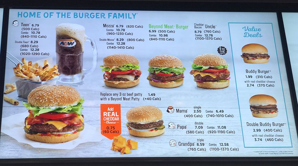
Let me count the reasons I hate this menu:
1. It's Animated
From time to time random stuff appears covering part of the menu. A&W is actually less bad at this than McDonalds who does multi-television animations hiding everything for seconds, but it's still distracting.
2. Cute names, no Explanation
It uses cute names ("Teen Burger") without actually explaining them. I could assume that the Mozza, Beyond Meat, and Uncle burgers are as pictured, but it's not clear if the "Teen" burger is pictured anywhere. Is that it bottom left? How is it different from the Uncle burger? More lettuce? That wouldn't account for the 260 calorie difference.
3. No Size Information
I'm told I can replace any 3oz beef patty with a Beyond Meat patty for $1.49. I'm not actually told which patties are 30z though.
I think there's three sizes of patty here, the patty used on the Uncle Burger, a smaller patty on the Teen burger, and a smaller one on the Buddy burger. But I really have no idea which one might be 3oz. I'm also guessing that those sizes exist.
4. No details beyond pictures
All of the differences have to be implied from a picture that's 10ft away. The use of pictures can be really helpful in some contexts (e.g. people who don't speak the language) but as the only way to convey the information it's really weak.
WHY TV Menus
My working theory is that chains are A/B testing different menu layouts to increase sales. It may be that pissing me off gets them a 1% increase in sales.